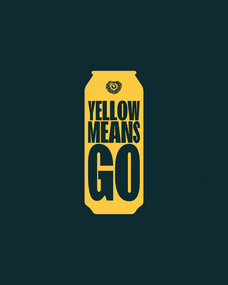
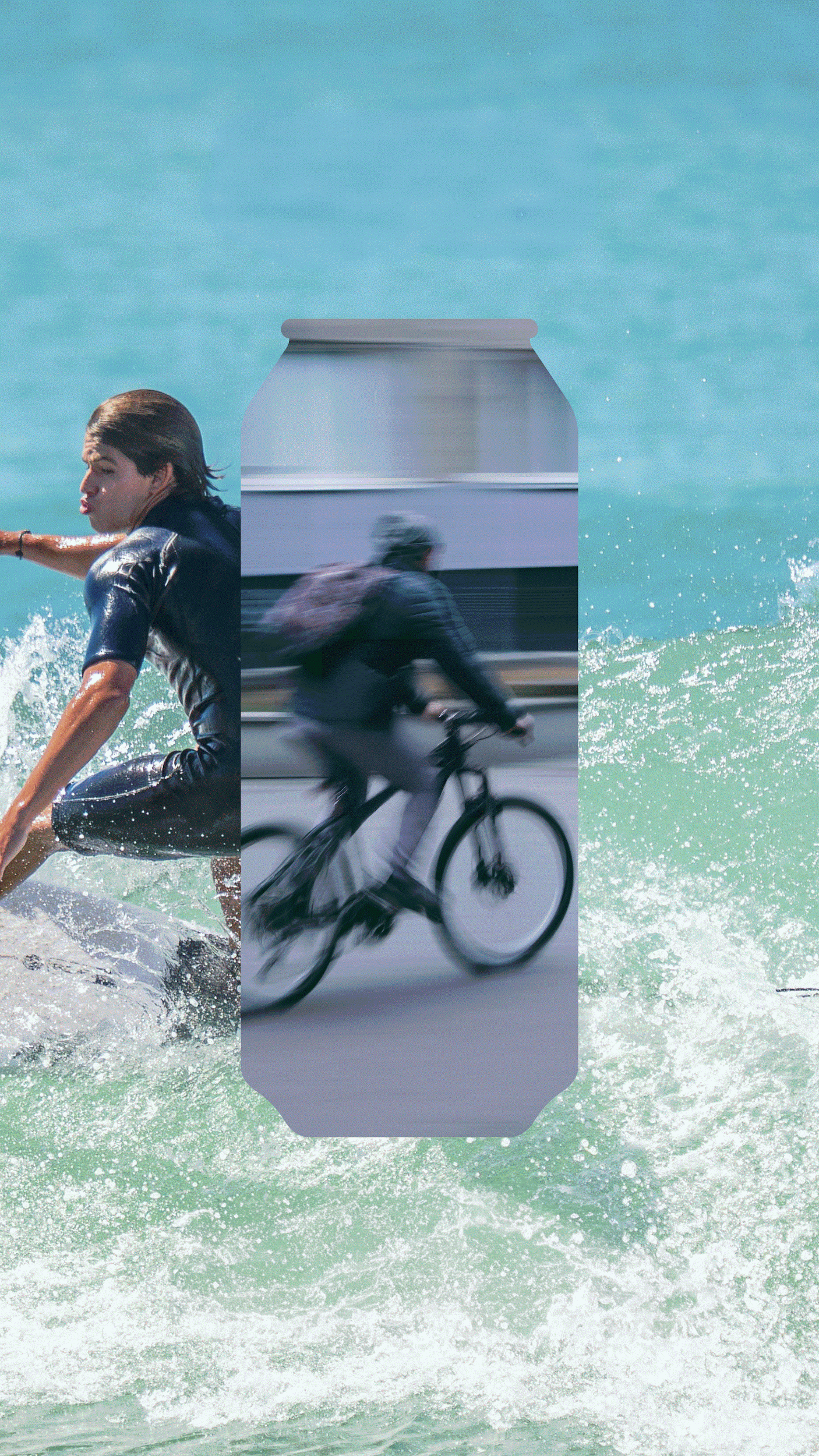
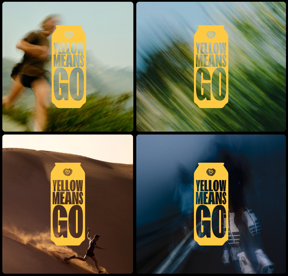
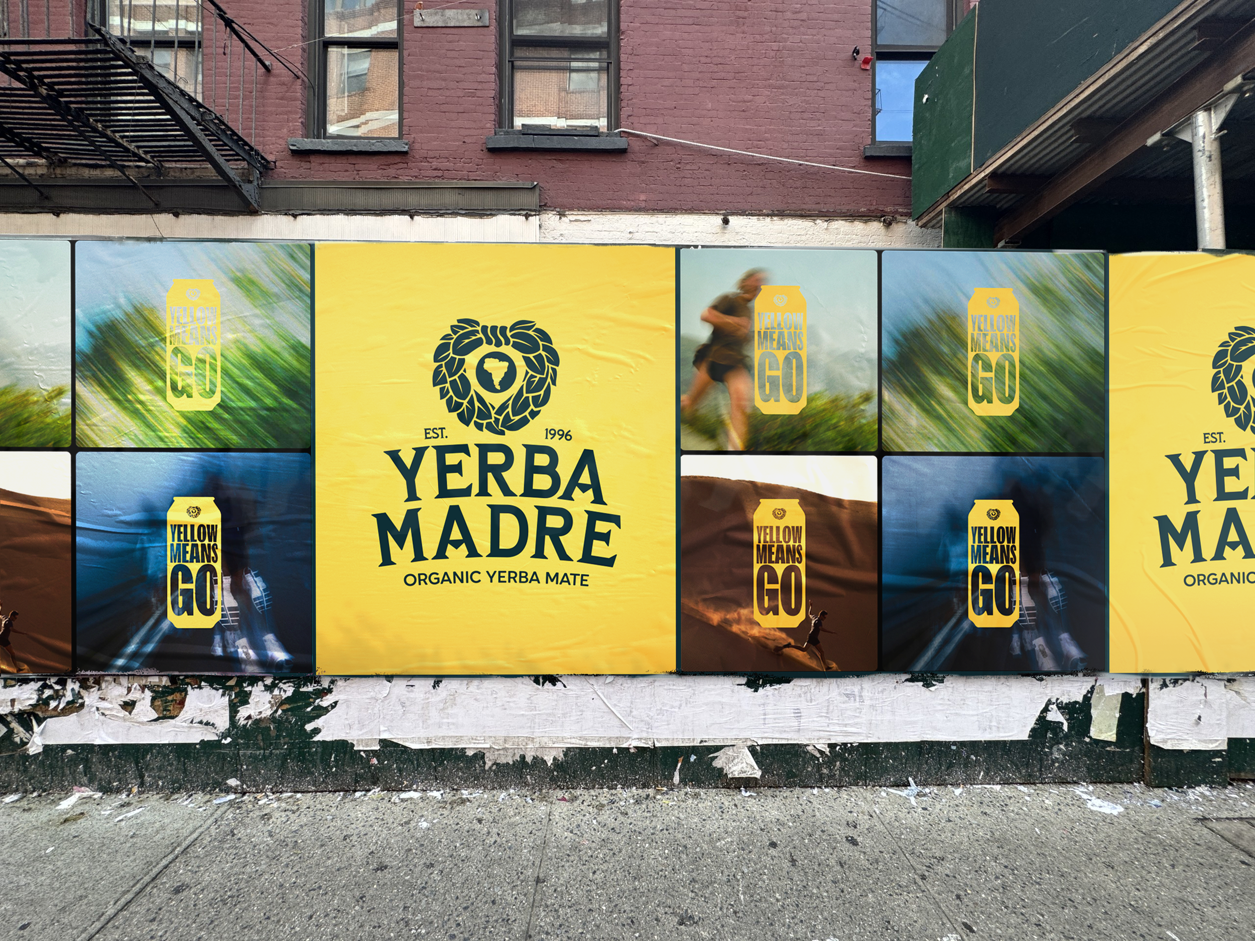
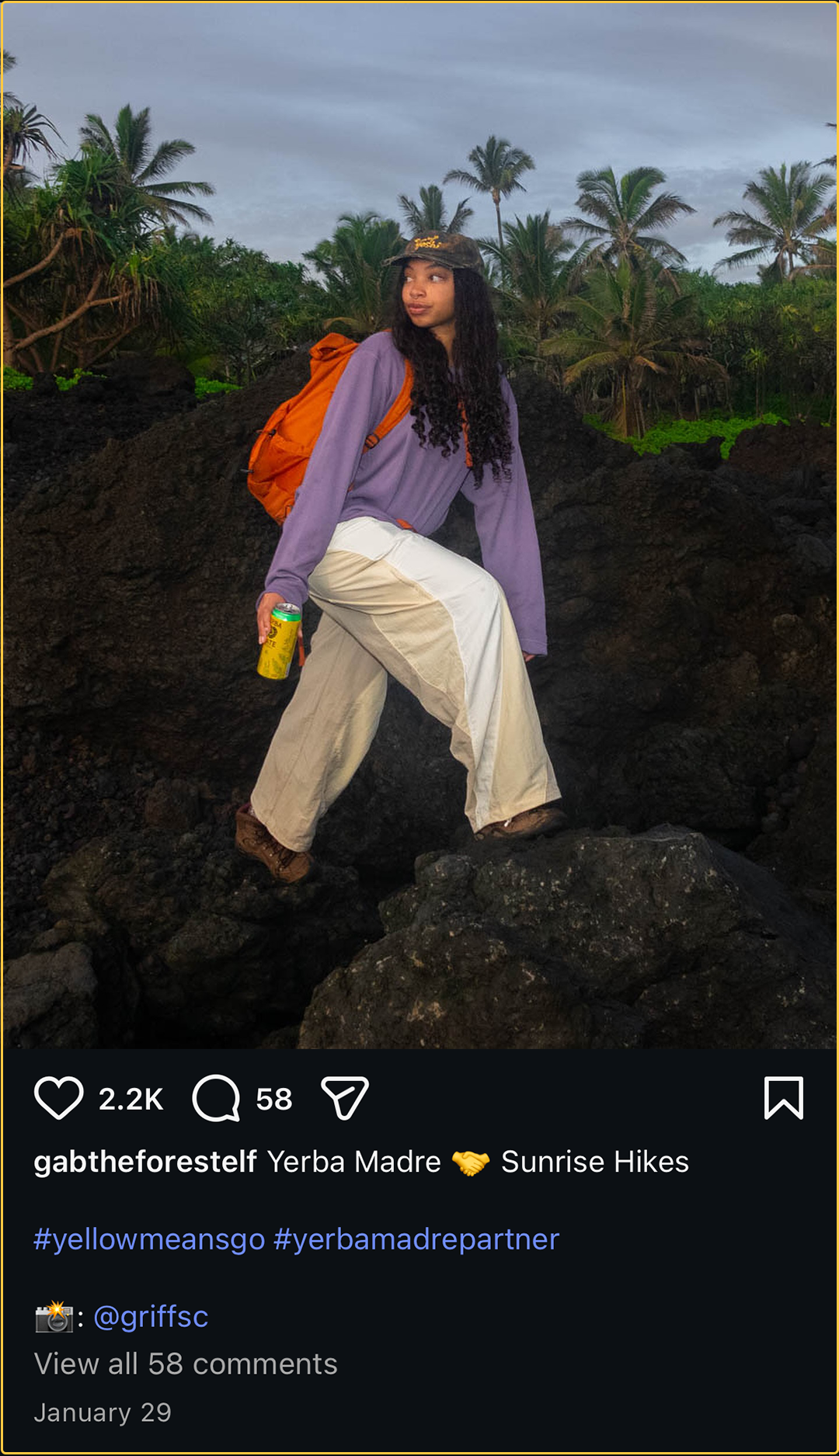
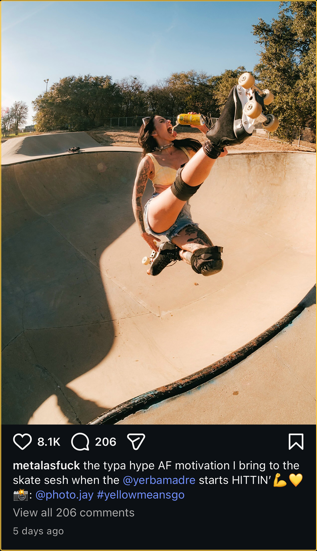
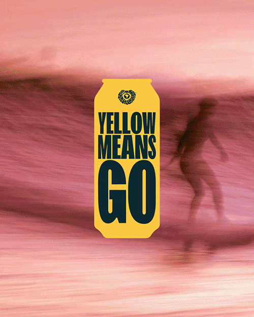
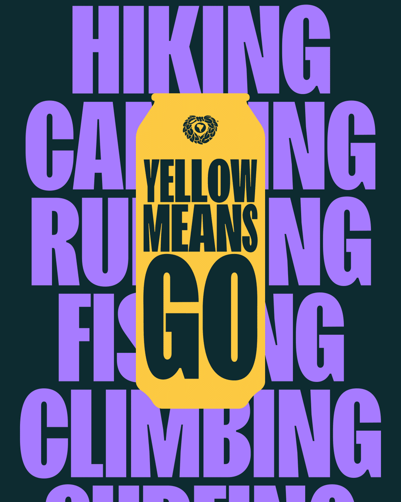
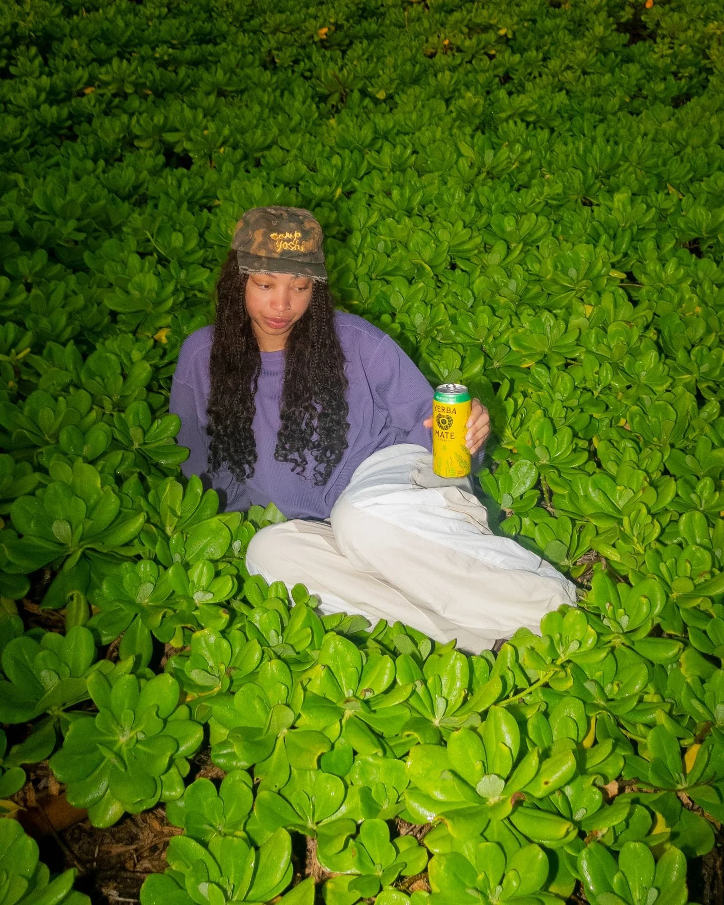
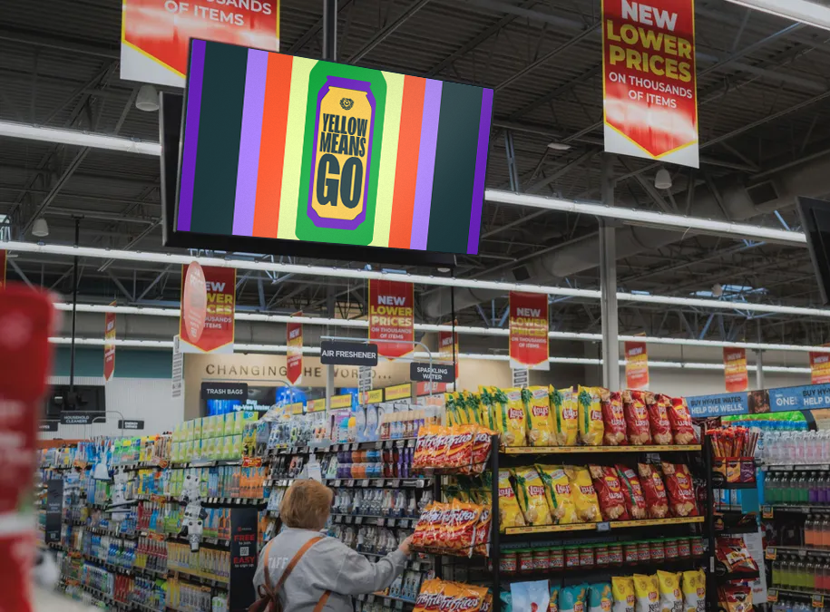
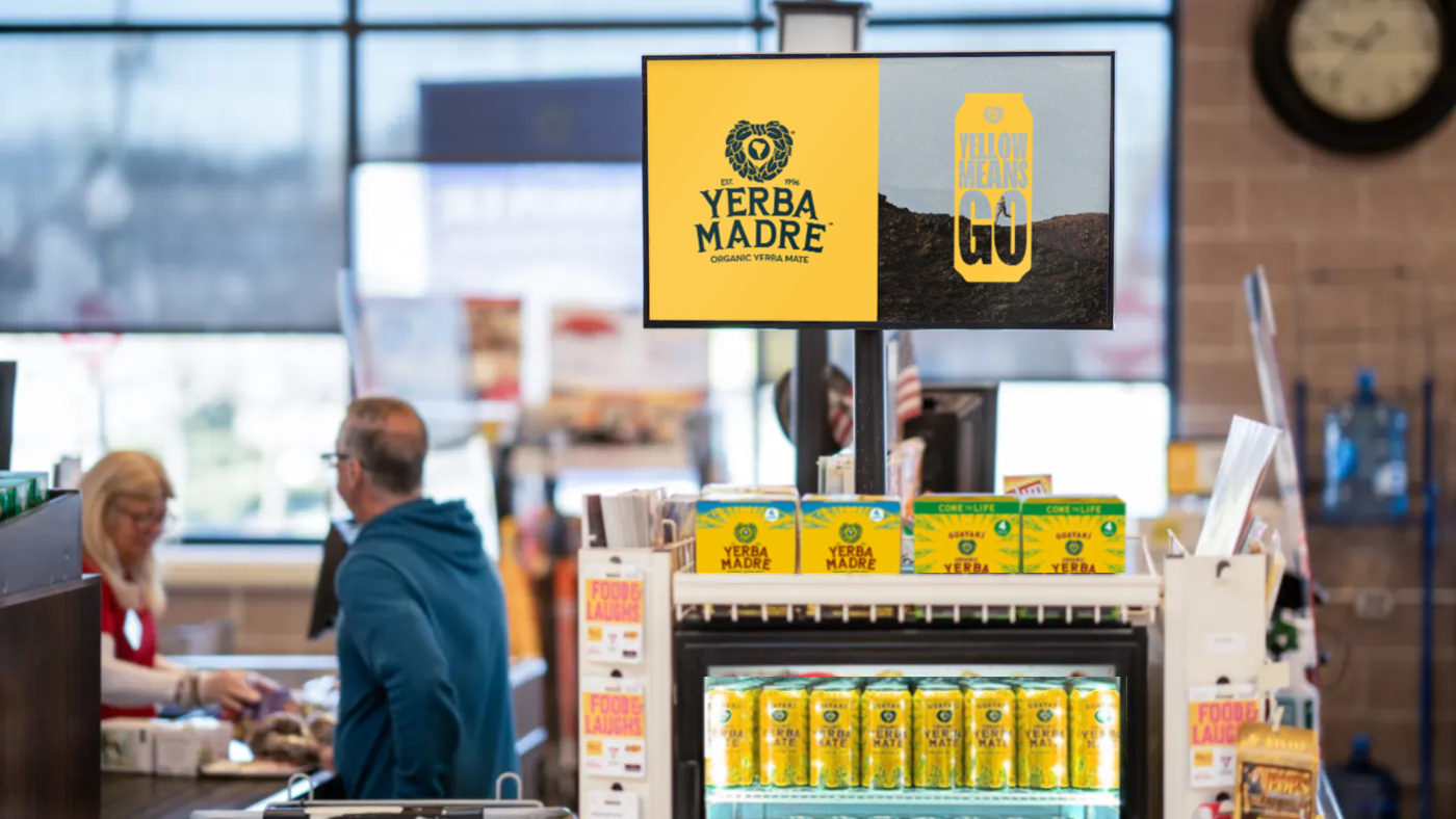
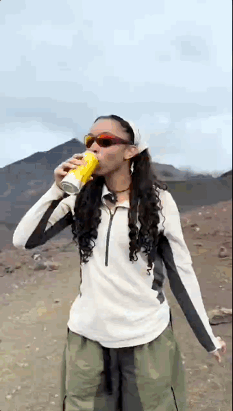
Yellow means caution except when it doesn’t. For Yerba Madre it meant get out and do stuff. All the stuff. We set out to create a brand campaign that was colorful, bold and flexible. One that showed a variety of outdoor activities that made you think to yourself “I want to go do that”. The campaign was mostly social but also ran in grocery stores and on Instacart. We partnered with a handful of influencers and sent them out into the wild show Yerbas community what Yellow Means Go actually means.
RESULTS: Over twenty thousands of organic likes on Instagram in just a few days | Evergreen social brand platform that can continue indefinitely.
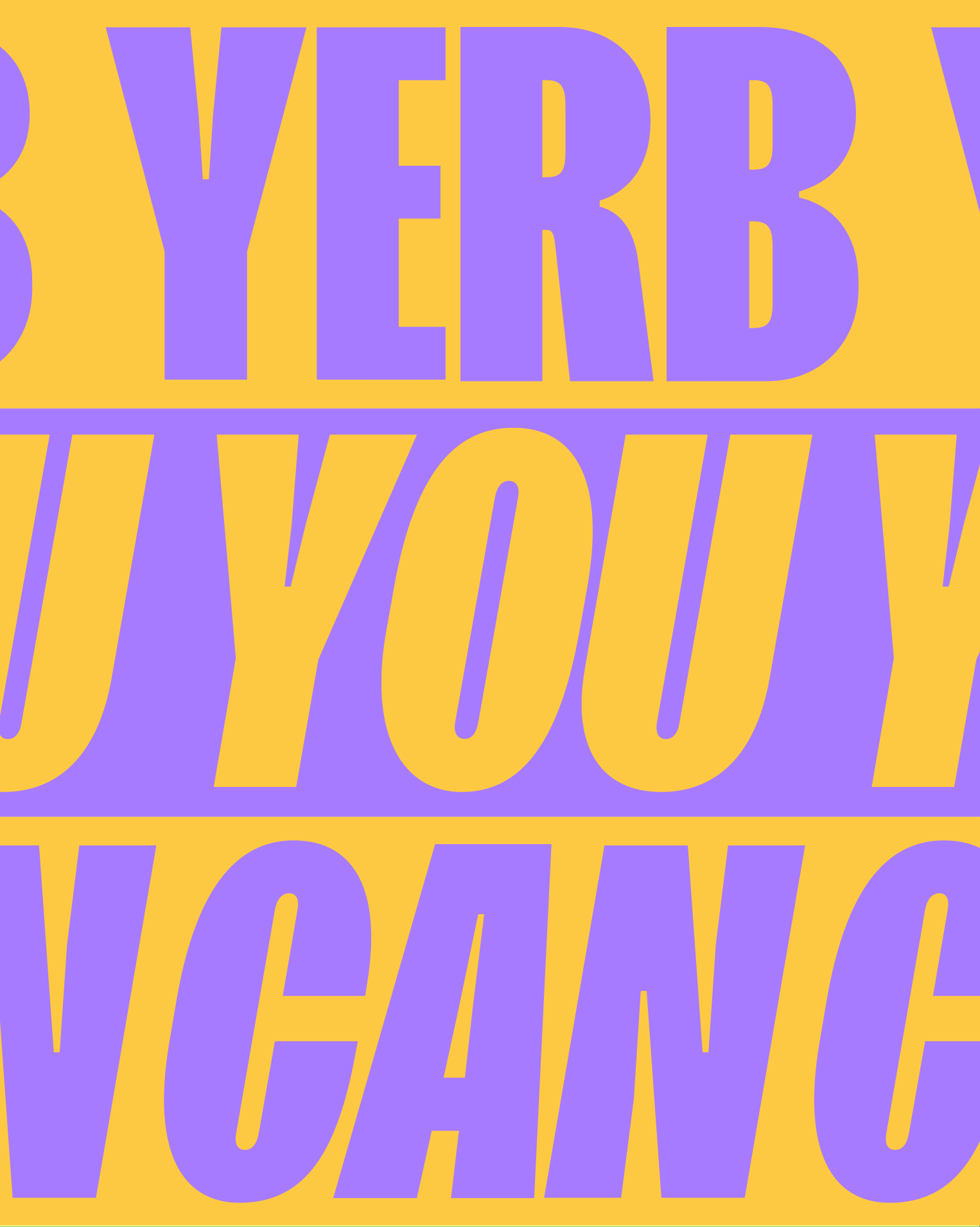
A can-paign for an energy drink known for it’s big yellow tallboy.
Yerba Madre
AGENCY: PDA
MY ROLE: CREATIVE DIRECTOR/ART
SKILLS: CREATIVE DIRECTION // ART DIRECTION // DESIGN // MOTION DESIGN // SHOPPER MARKETING // PHOTOGRAPHY // SOCIAL MEDIA